No products in the cart.
hints and tips
What Colours Should You Use In Your Cafe or restaurant?
 Whether you’re looking to give your cafe or restaurant a makeover, or starting out from scratch, it can be quite daunting when it comes to choosing a colour scheme. Did you know for example, that colour plays an important role in the psychology of food? In fact, it’s amazing how much colour affects a person’s appetite. If you’re keen to encourage your customers to linger longer and eat more food, then you might want to read on to find out which colours to use and which to avoid at all costs.
Grey
Grey is definitely a big no no! Let’s face it have you even seen a plate of greyish food that looks appetising? Grey is definitely not a colour to paint your interior walls.
Black
According to the experts black is a colour that can diminish a person’s appetite. It’s a great colour to make one look slimmer but its not a colour that when used on cafe walls is likely to stimulate anyone’s appetite.
Brown
Brown is another colour that does little for a person’s appetite. We seem to be following a bit of a pattern with dark colours! In fact many people associate the colour brown with food that is overdone or burnt. Although they may think of bread or other baked goods, this isn’t necessarily associated with appetite.
Purple
Purple isn’t a common food colour and those foods that are purple, such as aubergines, red onions, and red cabbage, aren’t necessarily that popular with many people. Because they don’t find these foods very tasty, purple isn’t a colour that makes everyone drool.
Blue
Blue is a colour that is associated with relaxation and calmness and is probably a better choice for bathrooms and bedrooms, where relaxation is key. People who are extremely relaxed are more likely to want to sleep than they are to order a slice of cake.
Turquoise
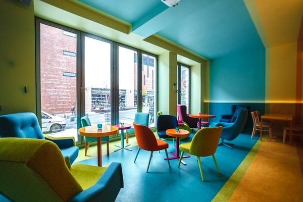
Turquoise which is somewhat brighter than blue is supposed to stimulate the appetite. It’s associated with feeling happy and carefree. It’s also the colour of tropical oceans and is often used for dessert plates. A person who feels full after dinner is still likely to eat a dessert when presented on a turquoise plate.
Green
Green is a colour that screams out with healthiness. Salads are full of green leaves and herbs and natural products are often packaged in green. Many people like the colour green and associate it with abundance. Green is definitely a good colour to promote healthy eating.
Yellow
Yellow is a bright cheery colour that has the ability to life one’s mood and make you feel happy. When people are feeling happy they’re more likely to want to eat than if they’re feeling miserable. Thus yellow is a great colour to include somewhere in your décor.
Orange
Orange is a colour which acts as a stimulant for the brain, increases brain activity, and often causes a person to feel hungry. There are plenty of healthy foods associated with the colour too, such as butternut squash, oranges, carrots, and pumpkins. It’s a warm welcoming colour and when people feel welcome somewhere they’re more likely to want to eat.
Red
This fiery colour raises a person’s blood pressure and heart rate and causes them to feel hungry. This is the reason that many cafes and restaurants use red table cloths or accents of red around the room.
Of course not everyone feels the same way about these colours so don’t take this guide too seriously. At Cafe Furniture Melbourne our cafe furniture comes in a plethora of colours so whatever mood you’re hoping to evoke with colour, you’re sure to find it in our store.